The colours of the earth
Nature does not use bright, primary colours. Walk through a forest and you see greens, but not the green of a paint chip. You see moss green, sage green, olive green, forest green, a hundred variations of a single hue. You see browns, but not a single brown. You see the brown of bark, of soil, of dried leaves, each different from the next. Nature's palette is muted, layered, and infinitely complex.
When we bring this palette into our spaces, they feel calm in a way that spaces with bright, saturated colours do not. The eye does not have to work hard to process muted, complex colours. It rests. And when the eye rests, the mind rests too. This is why nature-inspired colour palettes are the foundation of calm, restful interior design.
The neutral base
Every nature-inspired palette starts with a neutral base. Not white, which is clinical and flat, but warm, living neutrals. Ivory. Sand. Stone. Warm grey. These colours have depth and warmth that white lacks. They are the colours of natural materials, of limestone, of sand, of raw cotton, of unbleached linen.
Use this neutral as the dominant colour in the space, for walls, floors, and large furniture. It creates a calm, warm backdrop that lets other colours and textures shine. The neutral should be complex, not flat. A wall in ivory with a hint of warmth is more restful than a wall in pure white. The goal is not to create a blank canvas but to create a warm, breathing background.
Earth tones and greens
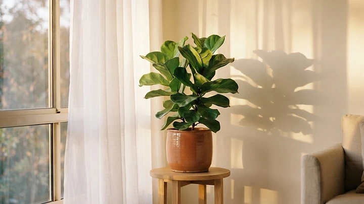
On the neutral base, layer earth tones and greens. Earth tones, terracotta, warm brown, ochre, clay, bring warmth and grounding. They are the colours of the earth itself, and they make a space feel rooted and connected. Use them for accents: cushions, ceramics, rugs, planters.
Greens are the colour of nature, and they are the most restful colour for the human eye. Use muted, complex greens, not bright, saturated ones. Sage. Olive. Moss. Forest. These greens connect the space to the natural world, and they pair beautifully with earth tones and warm neutrals. A room with a warm neutral base, earth tone accents, and muted green touches feels like a forest clearing, calm, warm, and alive.
Avoiding the artificial
The colours to avoid are the bright, saturated, and artificial ones. Primary colours. Neon accents. High-contrast combinations. These colours demand attention and create visual stress. They are the colours of advertising, not of nature, and they make spaces feel busy and anxious rather than calm.
This does not mean a space should be monochrome or boring. Nature is full of colour, but the colour is always muted, always complex, always layered. A terracotta cushion on a linen sofa. A moss green rug on a stone floor. A sage vase on a wooden shelf. These are colours that invite you to stay, not colours that demand your attention. When the palette is nature-inspired, the space feels like a natural environment, and the body responds with calm.
Keep exploring
Frequently asked questions
Stay close to nature
Letters on living with nature, occasionally in your inbox.


Come closer
Let us bring nature closer to your space.
Tell us about your home, your terrace, your office, and how you would like it to feel.